The Chippy Test: Why Your Signage Needs to Pass the Hungry 8pm Glance
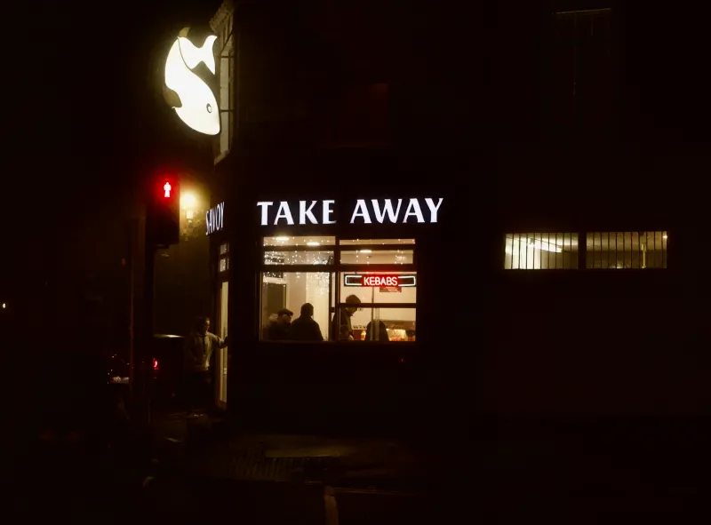
There's a particular moment on any British high street around eight in the evening. It's dark, it's drizzling, and someone is walking home hungry. They've got about four seconds and roughly fifteen pounds of decision-making in them, and they're going to give one shop their business.
We call it the chippy test, because the chippy is the purest version of it. Nobody browses a fish and chip shop. You either spot it, fancy it, and join the queue — or you walk straight past to the kebab place. There's no second chance. And the difference between the shop with six people waiting and the one with the lights on and nobody in? It's almost never the food.
The Fifteen-Metre Read
Here's the practical bit. When someone's walking towards your shop after dark, your sign has to do three things in sequence: get noticed, get read, and get understood. Most signage fails at step two.
Grab a colleague, walk fifteen metres down the road from your own shopfront at night, and honestly ask: can you read the shop name? Not squint-read it. Read it. If the answer's no, you've found your problem — and it's usually one of three things.
First, typeface. Script fonts and elaborate lettering look lovely on a design brief and vanish completely under street lighting. A hand-painted style can work, but the letterforms need real weight to them. Second, contrast. Gold lettering on a cream background might photograph beautifully at midday; at 8pm under a sodium streetlight, it's a beige smear. Third, size. The rule of thumb we use: if your main sign can't be read from across the road, it's a nameplate, not a sign.
Bright Isn't the Same as Bright Enough — or Too Bright
There's a temptation to assume the answer is simply more light. Then you end up opposite the takeaway that's lit up like a dental surgery, glowing so hard you can't actually make out the menu.
The sweet spot is even illumination with genuine contrast. A well-lit trough or halo-illuminated letters on a darker fascia will outperform a wall of raw brightness every time, because the eye reads edges, not lumens. This matters most for the details people actually decide on: the menu, the prices, the 'open' signal. If your prices are on a backlit panel that's got a couple of dead tubes, you're advertising that nobody's home.
And it's worth saying: halogen-era illumination is a maintenance trap. Old fluorescent troughs dim gradually, so the decline is invisible until one day your sign is a shadow of what it was. LED replacements hold their output and cost a fraction to run — worth checking even if the sign itself looks fine.
The Queue Is Part of the Sign
One thing the chippy teaches you that applies to every shopfront: the queue itself is advertising. People are herd animals, especially when hungry and unsure. A bright, legible sign gets the first two or three customers through the door; after that, the visible queue does the selling.
Which means the opposite is also true. A dim, half-readable fascia doesn't just fail to attract — it actively repels, because a poorly lit shop reads as closed, or worse, as struggling. On a dark street, your illumination is a signal of life.
A Quick Evening Audit
Try this before you spend anything. Walk your street at the hour your customers actually arrive, coming from both directions. Note which signs you can read at fifteen metres, which menus are legible, and which shops look open. Then look at yours with the same cold eyes.
If your fascia is dated but structurally sound, a vinyl overlay or a repaint of the lettering can transform legibility for a fraction of a full refit. If the lighting's the issue, an LED retrofit is often a day's work. And if the whole thing needs doing properly, that's a conversation — but it should start with the walk, not the catalogue.
Because the hungry 8pm glance doesn't care how much your sign cost. It only cares whether it can read it.