Two Seconds at Sixty: The Wrap Hierarchy That Turns Your Van Into a Signpost

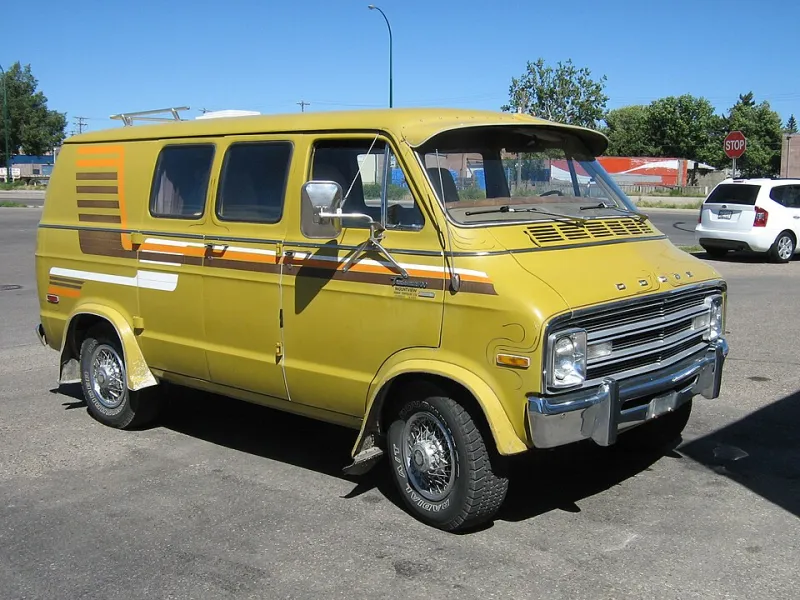
Photo: Wilfredor, CC0, via Wikimedia Commons
Stand at the side of an A-road for ten minutes and watch how long people actually get to look at a van. Not parked — moving. A car behind you at 60mph closes the gap, draws level, and it's gone. Call it two seconds, maybe three if you're lucky and the traffic's crawling.
That's the entire window your wrap has to work with. And yet most van designs we see before they go to print are built like they've got a minute and a half and a captive audience. Company name in a swirly font, a web address, a phone number, a tagline, five service icons, a QR code nobody will ever scan from the next lane over, and — for reasons lost to time — the full postal address.
It's not that any of these things is wrong. It's that all of them at once equals nothing. A wrap that says everything says nothing.
The Hierarchy: What Actually Matters
When we brief a design for a customer's van, we work through information in strict order of importance, and we're ruthless about it:
1. Who you are. The business name, big and legible. This is non-negotiable and it's the only element that gets to dominate.
2. What you do. Three words maximum. "Plumber" beats "Domestic and Commercial Plumbing Solutions Ltd" every single time.
3. How to reach you. One contact method, chosen carefully (more on this below).
That's it. That's the list. Everything else — taglines, social handles, accreditation logos, the address of a unit nobody's going to drive to on spec — is fighting for attention it will never win at speed.
Sizing for the Motorway, Not the Mailshot
Here's a rule of thumb worth memorising: text should be roughly one inch tall for every ten feet of viewing distance. A car behind you on the M62 might be thirty or forty feet away, closing fast. Do the maths and suddenly that elegant 40mm phone number looks like a typo.
As a practical benchmark:
- Business name: aim for letters you can read comfortably from around 100 feet
- Phone number or URL: readable from 40–60 feet minimum
- Anything smaller than that: it's decoration, and you should ask yourself why it's on the van at all
The other killer is typeface choice. Script fonts, ultra-thin weights, and anything with fussy serifs fall apart at speed and distance. The letters blur together. A font that looks sophisticated on your business card can be completely unreadable on the rear door of a Transit going past a layby.
Phone Number or Web Address?
This one comes up on nearly every wrap job, and the honest answer is: pick one, and pick it based on how you actually work.
A phone number suits trades where people ring on impulse — emergency plumbers, mobile mechanics, anyone whose customers have a problem right now. A driver spots your van, thinks "that's the one," and dials from the memory of a glance.
A web address suits businesses with a longer consideration cycle — landscapers, kitchen fitters, anyone whose customer is going to browse, compare, and think about it over a cuppa. Keep it short though. If your URL is more than about fifteen characters, it's dead weight. "freshsigns-print.co.uk" is fine; "freshsigns-print-and-signage-solutions.co.uk" is a novel nobody's reading.
And the QR code? On a parked van at a trade show, maybe. On a moving vehicle, it's a waste of vinyl. Nobody has ever scanned a QR code off a van doing 50mph, and the ones who tried nearly ended up in a hedge.
Contrast: The Silent Deal-Breaker
You can have the perfect hierarchy and the perfect font size and still lose everything to bad contrast. Silver lettering on a white van. Dark navy on black. Subtle grey-on-grey that looks minimalist in the design meeting and invisible in the rain.
The test is simple: print the design, pin it to the far wall, and squint. If you can't read it across the room, a driver can't read it across the carriageway. High contrast isn't a style choice — it's the difference between a mobile advert and an expensive respray.
Briefing Your Designer: Three Sentences That Change Everything
If you take one thing from this article, make it the brief. Before any design work starts, answer these in writing:
- "If a driver only reads one thing, what should it be?"
- "Where will this van spend most of its time — town crawling or dual carriageway?"
- "What's the one action I want people to take?"
A good designer will love you for it. A bad one will resist it, and that tells you everything you need to know before you've spent a penny.
The Honest Test Before You Print
One last exercise, and it costs nothing. Get the draft design, print it A4, and tape it to a gate at the end of your street. Walk past it at normal pace without stopping. What did you catch? Name? Service? Number?
Whatever registered in that five-second walk-past is roughly what a motorist gets. If the answer is "a nice logo and not much else," you've got a rolling decoration, not advertising — and it's much cheaper to fix on paper than it is after the vinyl's on.