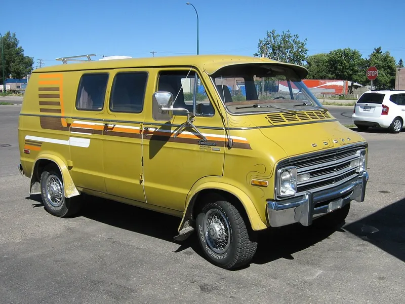
Ten Years On the Road: What We Found When We Peeled Back the Wraps of 2015

Photo: Metropolitan Transportation Authority of the State of New York, CC BY 2.0, via Wikimedia Commons
There's a strange pleasure in taking an old wrap off a van. Underneath the heat gun and the steady peel, you get a time capsule — a snapshot of what a business thought looked good, roughly ten years ago, when gradients were daring and every second van had a QR code slapped on the back doors.
We recently did exactly that. A handful of customers who first came to us in 2015 came back for rewraps, and rather than let the old vinyl go straight in the skip, we laid it out flat in the workshop and had a proper look. What we learned is worth sharing, especially if you're commissioning a wrap this year and want it to still look sharp in 2035.
The 2015 Look: Glossy, Busy, and Desperate to Be Scanned
The mid-2010s had a house style, and it was loud. Full-colour gradient backgrounds — think orange bleeding into purple — were everywhere. Drop shadows on every word. Bevelled edges. Company logos floating in reflective chrome.
And then there were the QR codes. Everyone had one. Big ones, small ones, ones crammed into the rear pillars where no human could reasonably scan them at a roundabout. One van we rewrapped had a QR code so large it took up nearly the entire back door, with the actual company name squeezed into a corner like an afterthought.
The logic wasn't mad. Smartphones were making QR codes feel futuristic, and a van felt like the perfect bridge between street and website. But in practice? Nobody scanned them. Not once, according to every owner we asked. One plumber told us he'd asked customers for years and never met a single person who'd snapped the code — though plenty remembered "the orange one with the big swirl."
Which tells you something important: people remembered the colour, not the gadget.
What a Decade of British Weather Actually Does
The physical condition of the old vinyl was its own lesson. The vans that had been garaged overnight looked nearly as good as the day they left us. The ones parked on driveways in Sheffield and Stockport, exposed to ten winters of frost, road salt and that one scorching summer we keep being surprised by, told a different story.
The edges lifted first — always the edges. Then the horizontal surfaces: bonnets and roofs faded noticeably where the sun hit hardest. Gloss finishes, it turns out, show every swirl mark and scuff by year six or seven. The matte wraps we'd done as experiments back then had faded more evenly, which is partly why matte went from niche to mainstream.
If there's a maintenance moral here, it's simple: where your van sleeps matters as much as what's printed on it.
What "Dated" Actually Looks Like
Laying ten years of vinyl side by side, a pattern emerged. The wraps that looked dated shared three traits:
- Trend-heavy effects. Gradients, chrome and lens flares pinned the design to a specific moment. You could date them like tree rings.
- Too much information. Phone numbers, landlines, websites, social handles, taglines, the QR code. By 2015 standards it looked thorough; today it looks like clutter.
- Novelty over identity. The vans that chased what was fashionable in 2015 needed rewrapping not because the vinyl failed, but because the design embarrassed the owner.
The wraps that still held up? Almost boringly simple. Clean typography. One or two brand colours. A logo big enough to read at thirty miles an hour. A phone number and nothing else competing with it. One joiner's van from 2015 — plain navy, white lettering, a single accent stripe — could be reprinted tomorrow and nobody would call it old-fashioned.
Principles Worth Wrapping Around
If you're spending money on a wrap this year, here's what the archive taught us:
Design for the two-second glance, not the close inspection. Nobody on the A34 is studying your van. One message, clearly delivered, beats five messages vaguely delivered.
Pick colours you can live with, not colours that are having a moment. Neon fades — literally and figuratively. Your brand colours should come from your signage, your uniform, your identity — not from whatever the internet is excited about this year.
Leave room to breathe. White space isn't wasted space; it's what makes the important bits readable. The busiest wraps in our archive aged the worst.
Plan the end date. A wrap is a ten-year decision at best. Budget for a refresh, keep your artwork files somewhere you'll actually find them, and choose a design you'd be happy to update rather than completely abandon.
The Nice Surprise
The best part of the whole exercise? Every single owner rewrapped. Not one had gone back to a plain, unbranded van. Ten years on, they'd all internalised the same lesson: a signed van earns its keep every day it's on the road.
The designs changed. The conviction didn't. That, more than any trend, is the thing worth carrying forward.